

Key Takeaways
Why Decorating Myths Are So Hard to Shake
Decorating rules get passed down the way family recipes do - confidently, repeatedly, and occasionally without much scrutiny. The result is a set of rigid guidelines that many homeowners follow not because they work, but because they've never been questioned. Some of these rules were once reasonable shortcuts; others were simply misunderstood. Either way, following them too literally is one of the most common reasons a room never quite feels complete.
Before adding more furniture or yet another throw pillow, it's worth doing a room-by-room décor audit to see which of these misconceptions might already be affecting your space.
Myth
All metals in a room should match. If you have brushed nickel hardware, every fixture, frame, and accent piece should be brushed nickel too.
Fact
Mixing metals intentionally creates visual depth and a more collected, layered look. The key is limiting the mix to two or three finishes and repeating each one at least twice.
The matching-metals rule likely emerged from a time when coordination was equated with quality. In practice, a room where every metal finish is identical can read as flat or overly catalog-like. Interior designers routinely combine warm metals (brass, gold) with cool ones (chrome, nickel) for contrast, provided the pairing is deliberate rather than accidental. Repetition is what makes mixing feel intentional: if you use unlacquered brass in a light fixture, echo it in a small tray or picture frame so the eye reads it as a choice.
Myth
Small rooms should always be painted in light, pale colors to make them feel larger.
Fact
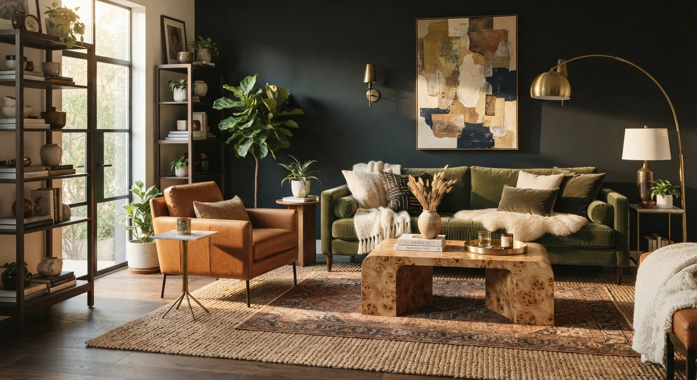
Dark, saturated colors can make a small room feel intimate and intentional rather than cramped - and may actually be more appropriate depending on the room's purpose.
Light colors reflect more light, which can help a space feel airy - but 'airy' isn't always the goal. A deep navy or forest green in a reading nook or powder room can create a sense of enveloping warmth that feels luxurious rather than suffocating. What actually matters in a small room is how light enters the space, how furniture is scaled, and how clutter is managed. Color is one variable among many. If the room lacks natural light, consult guidance on layered lighting strategies before defaulting to white paint as a fix.
Myth
Furniture should be pushed against the walls to maximize open floor space in the middle of a room.
Fact
Floating furniture away from walls and grouping it around a central anchor typically creates a more functional, visually cohesive arrangement.
This is one of the most persistently counterproductive habits in home decorating. When sofas and chairs line the perimeter of a room, they create a 'waiting room' effect - seating that faces inward without a clear focal point or conversational logic. Pulling furniture even a few inches from the wall and anchoring a grouping with a rug sized appropriately for the arrangement changes how the room reads entirely. The floor space in the 'middle' often just becomes a dead zone when the seating arrangement has no center of gravity.
Myth
A rug that fits inside the furniture footprint is the right size - you don't want it to look too big.
Fact
Undersized rugs are among the most common reasons living rooms look unfinished. A rug should extend at least under the front legs of all major seating pieces.
The visual function of a rug is to define a zone and unify the furniture within it. When a rug is too small - often meaning only the coffee table legs rest on it - it floats disconnected from the seating around it, making the arrangement feel arbitrary. The general guideline most designers use is that at minimum, the front two legs of sofas and chairs should rest on the rug. In larger rooms, all four legs on the rug is often the better choice. Sizing up is almost always the right call when in doubt.
Myth
Art should be hung at eye level, which means the center of every piece should be at roughly 57-60 inches from the floor.
Fact
The 57-60 inch center-of-image guideline is a useful starting point, but it breaks down over furniture, in gallery arrangements, and in rooms with lower or higher ceilings.
The museum-standard hanging height of 57-60 inches at center exists because it reflects the average standing eye level - useful in open gallery spaces where viewers move freely. In a home, art usually relates to the furniture beneath it. A large piece over a sofa, for example, should sit roughly 6-10 inches above the sofa back, not at an absolute floor measurement. Hung too high, it disconnects from the furniture and the room reads as unanchored. For gallery walls, treating the arrangement as a single unit and centering that unit at eye level is a more reliable approach than placing each piece individually.
Myth
Decorating a room means filling it - the more layered and accessorized a space is, the more finished it looks.
Fact
Volume of objects doesn't create a finished feeling. Intentional negative space and clear hierarchy between elements does.
Many rooms that feel perpetually incomplete actually have too much in them - too many small decorative objects competing for attention, too many patterns at the same visual weight, too many pieces of furniture without a clear arrangement logic. Negative space - the deliberate absence of objects - is itself a design element that allows the eye to rest and makes curated pieces feel more significant. If a room with lots of furniture still feels empty or unsettled, the issue is usually hierarchy and intention, not quantity. Understanding why fully furnished rooms still feel incomplete is often more instructive than adding more décor.
The Lighting and Color Myths That Do the Most Damage
Two categories of decorating advice cause more lasting problems than almost any other: lighting decisions and color choices. Both are highly visible, both affect how every other element in the room reads, and both are surrounded by oversimplified rules.
Most rooms rely on a single overhead fixture and stop there. That approach flattens the space and eliminates shadow and warmth - two things that make a room feel livable. Understanding how ambient, task, and accent lighting work together is one of the fastest ways to make a room feel more considered. Similarly, paint color affects far more than walls: sheen matters as much as hue, which is why choosing the right paint finish is a decision worth making deliberately rather than defaulting to flat white everywhere.
57-60"
Standard museum art hanging height from floor
This guideline reflects average standing eye level in open gallery spaces, but designers routinely adjust it based on furniture height and ceiling proportion in residential rooms.
2-3
Metal finishes that work well mixed in one room
Design professionals generally suggest limiting mixed metals to two or three distinct finishes, each repeated at least twice, to make the combination feel deliberate rather than accidental.
If you suspect your room has a persistent imbalance that better lighting or color alone won't fix, the issue may be visual weight distribution - a principle that governs how grounded and settled a room feels overall.
Don't Mistake 'More' for 'Finished'
Adding objects, patterns, or furniture to solve an unfinished feeling often makes the underlying problem harder to identify. Before purchasing anything new, assess what's already in the room - paying attention to scale, lighting, and arrangement - to understand what's actually missing. A single well-sized rug or a repositioned sofa may resolve what looked like a décor shortage.
Putting Corrected Principles Into Practice
Debunking these myths is only useful if the alternatives are actionable. A few grounding principles that tend to hold up across different room types and design styles:
- Anchor with scale first. Understand what scale means before selecting or arranging furniture. A loveseat in a large room and an oversized sectional in a small one both create the same problem - mismatch.
- Float furniture when possible. Pulling seating away from walls and grouping it around a central anchor - usually a rug or coffee table - creates conversation areas that feel intentional. If you're unsure how rugs layer and anchor space, that's worth understanding separately.
- Mix eras thoughtfully. A room composed entirely of matching pieces from a single style period can feel showroom-like rather than lived-in. Blending vintage and modern elements adds the kind of personality that purely coordinated rooms lack.
- Let accent walls work - when they're earned. An accent wall adds emphasis only when the wall itself has architectural purpose. Used randomly, it reads as decoration trying too hard.
Rooms that look finished aren't necessarily the product of more investment - they're the result of fewer unchallenged assumptions. Many widely-held beliefs about home improvement don't hold up, and the same is true in décor. See how similar myths affect broader home improvement decisions for a fuller picture of what conventional wisdom gets wrong.