

Key Takeaways
Visual Weight
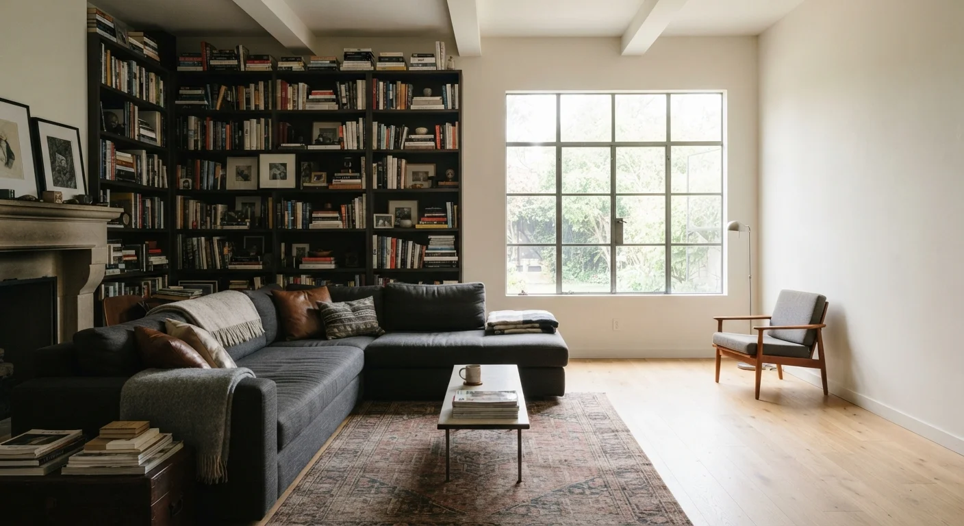
Visual weight refers to how heavy or light an object appears to the eye - not its actual physical mass. Dark colors, large forms, dense textures, and high-contrast patterns all make an object feel heavier visually. When the visual weight in a room is unevenly distributed, spaces feel lopsided, restless, or simply uncomfortable to be in, even when you can't immediately pinpoint why.
In design theory, visual weight is a core principle of compositional balance, related closely to the concepts of symmetrical, asymmetrical, and radial balance used by professional interior designers.
Why Your Living Room Feels Off - Even When Everything Is 'Fine'
You've arranged and rearranged the furniture. Nothing is broken, nothing is missing, and yet the room just doesn't feel right. That nagging discomfort usually has a name: visual weight imbalance. It's one of the most common - and least talked about - design problems in real American homes.
Unlike physical weight, visual weight is entirely about perception. Our eyes are wired to scan a room and register whether the visual mass feels distributed or concentrated. When one corner, wall, or zone carries significantly more visual weight than the rest of the space, the brain registers it as tension. The room feels unsettled, even if every individual piece is attractive on its own.
This connects closely to what designers call scale - the relationship between your furniture's size and the room around it. If you've ever wondered why a room full of furniture still feels incomplete, understanding visual weight is often the missing explanation.
~60%
Of homeowners report feeling dissatisfied with their living room layout
According to general consumer surveys on home satisfaction, layout and proportion issues are among the top complaints, often tied to unresolved balance and scale problems.
3-5 min
Time it takes most people to sense visual imbalance
Design researchers note that perceptual discomfort from spatial imbalance is typically registered within a few minutes of entering a room, even without conscious awareness of the cause.
1
Rug adjustment can anchor an entire seating arrangement
Interior designers widely cite improper rug placement as one of the single most correctable sources of visual instability in residential living spaces.
What Increases and Decreases Visual Weight
Several properties make objects read as heavier or lighter to the eye:
- Color: Dark, saturated tones carry more visual weight than light or neutral ones. A charcoal sofa anchors a room more heavily than a cream-colored one of identical size.
- Texture: Rough, chunky, or layered surfaces feel heavier. Smooth, reflective, or open surfaces feel lighter. A stone fireplace surround has far more visual weight than a painted drywall panel.
- Size and solidity: Large pieces with closed bases feel heavier than smaller pieces with exposed legs. A skirted sofa reads heavier than a sofa raised on slender wood legs.
- Pattern density: A high-contrast, busy pattern increases visual weight. A subtle, low-contrast print or solid fabric decreases it.
- Quantity: A cluster of objects - even small ones - accumulates visual weight. A single large piece can feel lighter than five medium pieces grouped together.
Understanding these variables gives you practical levers to pull without necessarily buying anything new. Many common decorating assumptions actually work against balanced visual weight without homeowners realizing it.
The Most Common Imbalance Patterns
Living rooms tend to develop visual weight problems in predictable ways:
The Heavy Anchor Wall
One wall holds the television, a media console, and a gallery arrangement - while the opposite wall is largely bare. All the visual mass lives in one zone, pulling the room off-center. An accent wall can either correct or worsen this depending on placement.
The Floating Rug Problem
An area rug that doesn't fully anchor the seating arrangement creates a floating effect - furniture appears to drift rather than belong together. This makes the room read as heavier around its edges and hollow in the middle.
Top-Heavy Arrangements
When artwork, shelving, and decorative objects cluster high on walls while the lower half of the room stays bare, the room feels visually unstable - top-heavy in a way that reads as slightly anxious or incomplete.
One-Sided Furniture Clustering
In rectangular living rooms especially, all the major seating often ends up on one long wall. The opposite side becomes a visual void that no amount of small decorative objects can compensate for.
How to Redistribute Visual Weight Without Starting Over
Rebalancing doesn't require a full renovation or new furniture purchases. These adjustments address the root problem:
Use Light Elements to Counter Heavy Ones
Place a large mirror, a tall plant, or a grouping of lighter-toned framed prints on the wall or zone opposite your heaviest furniture. Mirrors are particularly effective because they introduce both reflective surface (light) and perceived depth (space).
Introduce Vertical Weight Strategically
If visual weight pools low in the room, tall elements - floor lamps, standing plants, tall narrow shelving - draw the eye upward and distribute weight more evenly across the room's full height.
Layer Textiles to Add Weight Where Needed
A sparse corner or bare sofa end can gain visual weight through layered throws, a stack of books, or a textured pillow arrangement. This is one of the fastest, most affordable tools available.
Re-examine Your Rug Placement
Move your rug so that at least the front legs of all major seating pieces rest on it. This connects the furniture grouping and redistributes visual mass toward the room's center rather than its perimeter.
Before adding anything new to address the imbalance, it's worth conducting a full assessment of what you already have. A room-by-room décor audit can reveal whether rearranging existing pieces solves the problem before you spend a dollar.
Symmetry Versus Asymmetrical Balance
Many homeowners default to symmetrical arrangements - matching lamps flanking a sofa, identical nightstands - because symmetry signals balance clearly and immediately. It works. But it can also feel formulaic, and it doesn't suit every room's architecture or furniture collection.
Asymmetrical balance achieves the same equilibrium using different objects with equivalent visual weight. A large dark armchair on one side might be balanced by a medium-toned console with a lamp and a plant on the other. The objects don't match, but they carry enough visual weight to hold each other in check.
This principle also applies to scale relationships between furniture and room size - balance is always contextual, not absolute. What creates equilibrium in a 12×14 room won't produce the same effect in a 20×24 great room.
“Balance in a room isn't about matching things - it's about giving the eye a reason to travel the whole space without getting stuck or falling off an edge. Visual weight is the tool that makes that possible.”
— A practicing interior designer, Residential design consultant with over two decades of client project experience