

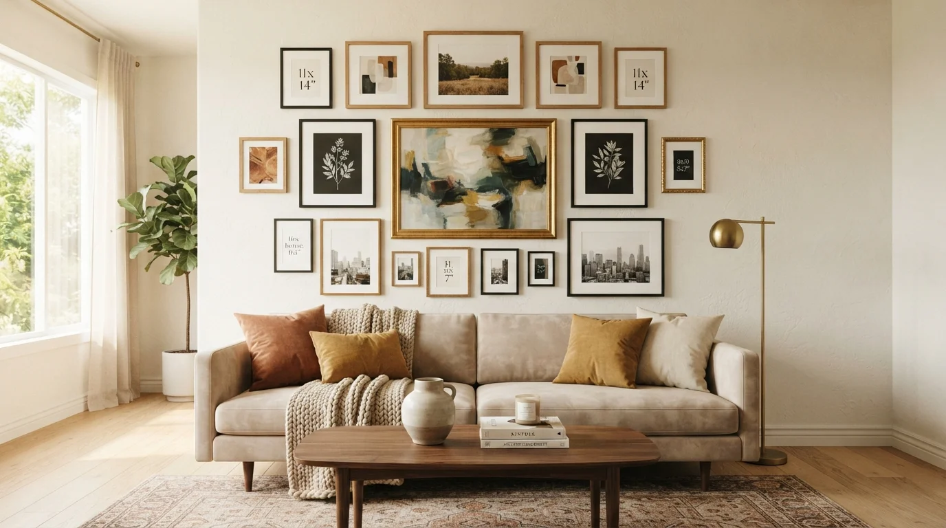
Key Takeaways
Why Gallery Walls Fail Before the First Nail Goes In
Most gallery wall problems are planning problems. Frames go up one at a time, each added with good intentions, until the wall looks more like a storage unit than a design statement. The fix isn't talent - it's process. A gallery wall succeeds when you treat the blank wall as a canvas and resolve the composition before committing to hardware.
This is particularly worth considering if you're weighing a gallery wall against other feature-wall approaches. As explored in our piece on when accent walls work and when they backfire, the wall treatment you choose should serve the room's existing proportions - not fight them. A gallery wall on an awkwardly narrow wall or directly above busy furniture can compound visual noise rather than resolve it.
Before sourcing frames or art, do a quick audit of the space. Note the wall's dimensions, the height of nearby furniture, and any architectural features (light switches, vents, windows) that will constrain your arrangement. This groundwork shapes every decision that follows.
What you will need
Tools and Materials You'll Need
Gathering the right supplies before you start saves you from mid-project trips to the hardware store and prevents the common mistake of eyeballing measurements that should be precise.
Tape measure
Measure wall dimensions and calculate precise spacing between frames.
Painter's tape
Mark frame outlines on the wall to preview your layout without making holes.
Kraft paper or newsprint
Trace frame backs to create paper templates for floor planning and wall mapping.
Level (bubble or laser)
Ensure each frame hangs straight and rows align horizontally.
Hammer and picture hooks
Hang frames securely using the appropriate hook weight rating for each piece.
Pencil
Mark nail positions before driving hardware into the wall.
Stud finder
Locate wall studs for hanging heavier frames without relying solely on drywall anchors.
Step-by-Step: Building Your Gallery Wall
Follow these steps in order. Skipping the layout phase is the single most common reason gallery walls require complete do-overs.
Gather and assess all your frames
Lay every frame face-up on the floor in the room where the gallery wall will live. Note the dimensions of each piece and group them loosely by size: large (anchor candidates), medium, and small. Identify which pieces share colors, finishes, or subject matter - these natural groupings will inform your arrangement.
Trace paper templates for each frame
Place each frame face-down on kraft paper or newsprint and trace around the outer edge. Cut out each shape and mark its hanging hardware location on the back of the template - this is where the nail will go. Label each template with the frame's name or a simple number so you can track it easily.
Design your layout on the floor
Using the paper templates, arrange the composition on the floor in front of the target wall. Start by placing your anchor piece - typically the largest or most visually prominent work - near the center of the arrangement. Build outward from there, alternating sizes and maintaining roughly equal negative space between pieces.
Aim for a silhouette that reads as a unified shape: a rectangle, an irregular oval, or a structured grid. Avoid letting small frames cluster at the edges while large ones dominate the center - distribute visual weight across the whole arrangement.
Transfer the layout to the wall using painter's tape
Tape your paper templates directly onto the wall in the positions determined during your floor layout. Step back frequently - at least 8 to 10 feet - to evaluate the composition at viewing distance. Adjust template positions as needed. The goal is to resolve all spacing decisions before making any holes.
A standard spacing guideline is 2 to 3 inches between frames. Tighter spacing (1.5 inches) works for dense, graphic arrangements; wider spacing (4+ inches) suits more minimal or gallery-style displays.
Mark nail positions and remove templates
Once your layout is confirmed, mark each nail position through the template onto the wall using a pencil. Press firmly so the mark transfers accurately. Remove the painter's tape and paper templates carefully, leaving only the pencil marks.
Hang the anchor piece first, then work outward
Drive the first nail or hook at your anchor piece's marked location. Hang that frame and verify it's level before touching another nail. Every subsequent frame should be measured and leveled relative to its neighbors - don't rely on visual estimation once you're working this close to the wall.
Work outward from the anchor in a logical order: hang adjacent pieces next, then fill in the periphery. Avoid jumping to opposite ends of the arrangement before the middle is settled.
Live With Your Layout Before Committing
Leave the paper templates taped to the wall for a day or two before driving any nails. You'll notice things at different times of day - how the morning light hits the wall, how the arrangement reads from the sofa in the evening - that you won't catch in a single planning session. Making adjustments at the tape stage costs nothing.
Mixing Frames Without Creating Chaos
Frame mixing is where most decorators either play it too safe - buying a matching set that reads as flat - or go too far, combining styles with nothing in common. The guiding principle is unity through one shared variable.
If your frames vary in shape and size, keep them in the same finish family: all matte black, all natural wood, or all metallic. If you want to mix finishes - say, black and brass - unify them through mat color instead. A consistent cream or white mat across every frame creates enough visual order to allow the frame variety to read as intentional eclecticism rather than accident.
This thinking aligns closely with broader décor principles. Our guide on mixing old and new in eclectic interiors covers how the same "anchor variable" approach applies to furniture and accessories throughout a room.
Avoid combining more than three distinct frame materials in a single gallery wall. Beyond three, the eye struggles to find a resting point. Also resist the temptation to match frames exactly to your wall color - a slight contrast helps each piece register as intentional rather than camouflaged.
Finally, consider negative space. Frames packed edge-to-edge eliminate the breathing room that makes individual pieces readable. The wall itself is part of the composition. If you find your arrangement feels heavy or overwhelming, removing one or two frames is often more effective than rearranging everything.
For a broader look at common missteps that keep rooms feeling unresolved, see our article on decorating misconceptions that keep rooms looking unfinished.