

Key Takeaways
Color Temperature in Interior Design
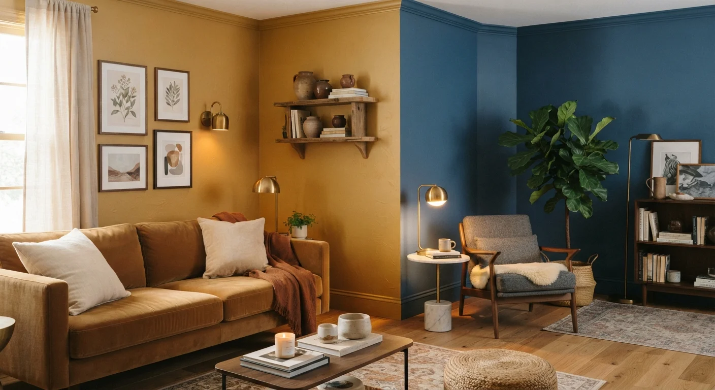
Color temperature refers to how warm or cool a color appears to the eye. Warm colors - reds, oranges, yellows, and earthy neutrals - tend to feel cozy, energizing, or intimate. Cool colors - blues, greens, and gray-purples - tend to feel calm, spacious, or refreshing. Understanding this spectrum helps you make deliberate choices about how a room feels, not just how it looks.
The term also applies literally to light sources: light bulbs are measured in Kelvins (K), with lower numbers (2700-3000K) producing warm amber light and higher numbers (5000K+) producing cool daylight-like light. Both the paint on your walls and the bulbs in your fixtures contribute to a room's overall color temperature.
Why Color Temperature Changes How a Room Feels
Walk into a room painted a deep terracotta and you'll likely feel something - a sense of warmth, maybe groundedness. Step into a space washed in pale blue-gray and the feeling shifts entirely. That's color temperature at work, and it operates largely below conscious awareness.
Warm colors are said to advance - they appear closer than they are, which makes large, airy rooms feel more enclosed and human-scaled. Cool colors recede, creating an optical sense of distance that can make tight spaces breathe easier. Neither quality is inherently better; each is a tool.
This principle matters most when you're designing rooms with specific functions. A bedroom meant for winding down may benefit from muted, cool tones that signal calm. A dining room intended for lively gatherings might call for warm amber walls that encourage lingering conversation. Thinking about what you want to feel in a space - not just what you want to see - is often the more useful starting point.
2700K-3000K
Kelvin range for warm residential lighting
Lighting designers commonly recommend this range for living rooms and bedrooms to achieve a cozy, incandescent-style glow.
60%
Homeowners who repaint within 2 years of purchase
According to surveys by home improvement industry groups, paint color is one of the first changes buyers make - underscoring how much color affects perceived comfort.
5000K+
Kelvin range for daylight-spectrum bulbs
Daylight bulbs are commonly used in workspaces and garages but can make residential color palettes look cooler and more clinical than intended.
The Role of Lighting in Color Temperature
Paint color is only half the equation. The light source illuminating a room dramatically shifts how any color reads in practice. This is why a swatch that looks perfect at the hardware store can surprise you once it's on the wall at home.
Light bulbs are rated in Kelvins (K). Bulbs in the 2700-3000K range produce a warm, amber-toned glow similar to traditional incandescent light - flattering for skin tones and cozy for living spaces. Bulbs around 4000K offer a neutral, white light suited to kitchens and workspaces. Daylight bulbs at 5000K and above emit a blue-white light closer to natural sunlight, which can feel clinical in residential settings if used carelessly.
A warm-toned wall painted in a peachy beige will look rich and inviting under 2700K bulbs - and potentially washed-out or even slightly orange under cool daylight bulbs. Testing paint colors under the actual bulbs you plan to use is one of the most underrated steps in any decorating project. For a deeper look at how light sources layer together in a room, see our guide to ambient, task, and accent lighting.
Test Paint Swatches Under Your Actual Bulbs
Before committing to a wall color, paint a large swatch - at least 12 by 12 inches - and observe it at different times of day and under the lighting you'll actually use in the room. A color that looks balanced in natural daylight may shift noticeably under your evening lamps. This single step prevents the most common paint regrets.
Mixing Warm and Cool Tones Intentionally
A common misconception is that a room should commit fully to one temperature or the other. In practice, rooms that lean entirely warm can feel stifling, and spaces that skew entirely cool can feel sterile. Balance is what makes a room feel resolved.
The most reliable approach is to choose a dominant temperature and introduce the opposing one as an accent. A room with warm honey-toned wood floors and cream walls might benefit from a single cool-toned area rug or a set of slate-blue throw pillows - just enough contrast to keep the space from feeling heavy.
Neutrals play a bridging role here. True neutrals (balanced beiges, greiges, warm grays) contain both warm and cool undertones, which makes them versatile mediators. But even neutrals lean one way or the other, so reading undertones carefully before choosing a neutral matters just as much as with full-color choices.
When in doubt, observe how designers use color temperature in spaces you find appealing - in magazines, design blogs, or even well-appointed public spaces - and notice whether the dominant temperature matches the mood you'd like to recreate at home.
Practical Room-by-Room Guidance
Applying color temperature principles room by room helps translate theory into real decisions.
- Living rooms: Warm tones (terracotta, warm white, golden yellow) support sociability and relaxation. Cool accents - a blue-green plant, a gray sofa - keep warmth from feeling overwhelming.
- Bedrooms: Muted cool tones like dusty blue or sage green promote calm. Warm wood furniture or warm-toned lighting can prevent the room from feeling cold.
- Kitchens: Bright, cool lighting (4000K) aids task visibility, but warm cabinetry or countertop materials balance the clinical effect of that light.
- Home offices: Cooler, more neutral tones tend to support focus. Avoid very warm, saturated colors, which can feel distracting in work environments.
- Bathrooms: Both temperatures work depending on intent. A spa-inspired bathroom leans cool; a cozy, intimate bath benefits from warmer tones.
The goal is deliberate choice rather than default. When you understand that color temperature is a lever you can pull - toward energy or calm, intimacy or openness - every paint chip and bulb selection becomes a meaningful decision rather than a guessing game.